
How to improve user experience? How to invent new ideas? Why are some designs changing? How to ensure that new ideas actually improve the user experience (UX)?
There are many more design related questions for sure. In this blog we will start to provide you with design insights, explain what is important to us, what is our way of working, our project objectives, evaluations and conclusions as well.
In short: how we design Sailfish OS.
Our Design philosophy
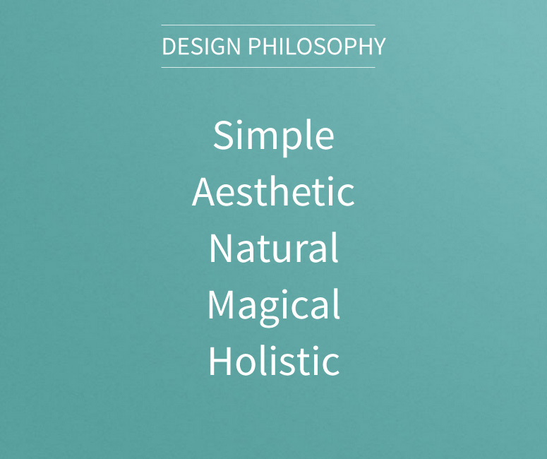 It all starts from a basic idea, a so-called design philosophy, which energizes us and supports our decision making process. The basic elements here are:
- Simple – We aim at making complex user experiences simpler
- Aesthetic – Our design should be aesthetically pleasing, balanced and beautiful
- Natural – Designs should look and feel truly natural, whether it’s a task flow, haptics or material
- Magical – There should be magic, a positive surprise, an innovation or personal sensation when using our products or services
- Holistic – Our designs should create holistic connections between user needs, technology and business requirements
What do we actually do within Design?
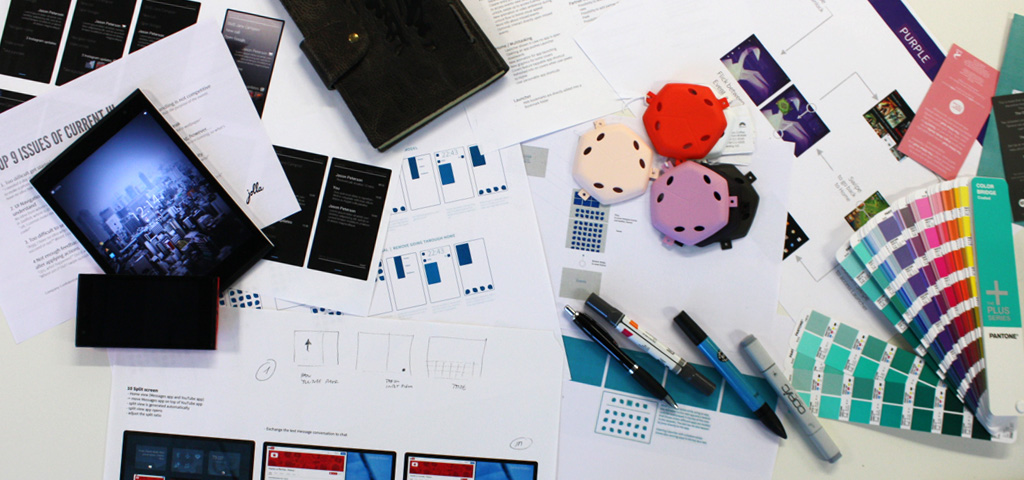
Diversity and different viewpoints are important to do awesome design. We (six Jolla designers) are originally from three different nationalities and have different educational backgrounds, some of us are more logical thinkers while others are more visual designers. All of us have experiences in multidisciplinary work and have gathered tremendous experiences while designing other OS:s, many products, apps, services or solutions in the past. The Design team works very holistically and we of course cooperate with all teams within Jolla; especially we cooperate very closely with product management and of course software development teams.
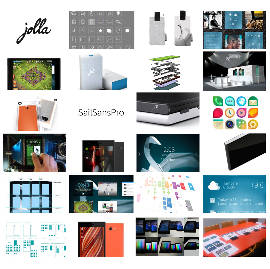 In a nutshell we design:
- User Interface for Sailfish OS: meaning definitions of use cases, interaction flow charts for UI framework and apps, behavior & logic of SW components
- Stunning Graphical Design: e.g. user interface layouts, icons, fonts, ambiences/themes, art work for packaging, user guides and other printed material
- Attractive and useful Motion Design: e.g. user interface animations, demos and promo videos
- Craft beautiful and striking Industrial Design: ergonomics, define material & colours, ID renderings, exhibition stands
- The Creative Design direction: I believe that everybody is creative, there are incredible ideas right here, around you, next to you. Combined with our own ideas, we streamline and define the creative design direction.
![Design_process[1]](https://blog.jolla.com/content/uploads/2015/04/Design_process1-300x251.jpg) Our way of working
Our way of working
![Design_process[1]](https://blog.jolla.com/content/uploads/2015/04/Design_process1.jpg)
Designing a major OS update does not happen within a few weeks, it’s a much longer process, spreading over several months. It isn’t trivial either, because an operating system is a very complex and intertwined construct in which every element relates to another one.
In order to achieve best possible results, feasibility and to avoid endless discussions based on subjective statements (“I like this and not this” “Why?” “Because it is me“) we applied a structured design process, including a lot analyzing, concepting, building prototypes, evaluation and doing it over again and again until we’re satisfied. During such a process there are moments of satisfaction and happiness, however also times of disappointments whenever you get stuck, do not find the right solution or when you notice that you have to let go your very ‘loved’ feature because it is not a ‘key’ feature based on the project objectives.
Sailfish OS 2.0 – Design Insights
Sailfish OS is currently evolving to the next generation (‘Sailfish OS 2.0’) and there are many design related questions, which we are working on, like: Why is the User Interface perceived as simpler than before? How can I close an app super quickly? How to access Events? Can I have two Cover actions?
There isn’t just one reason why the UI is perceived simpler while very appealing. Instead it’s a combination of at least the following items:
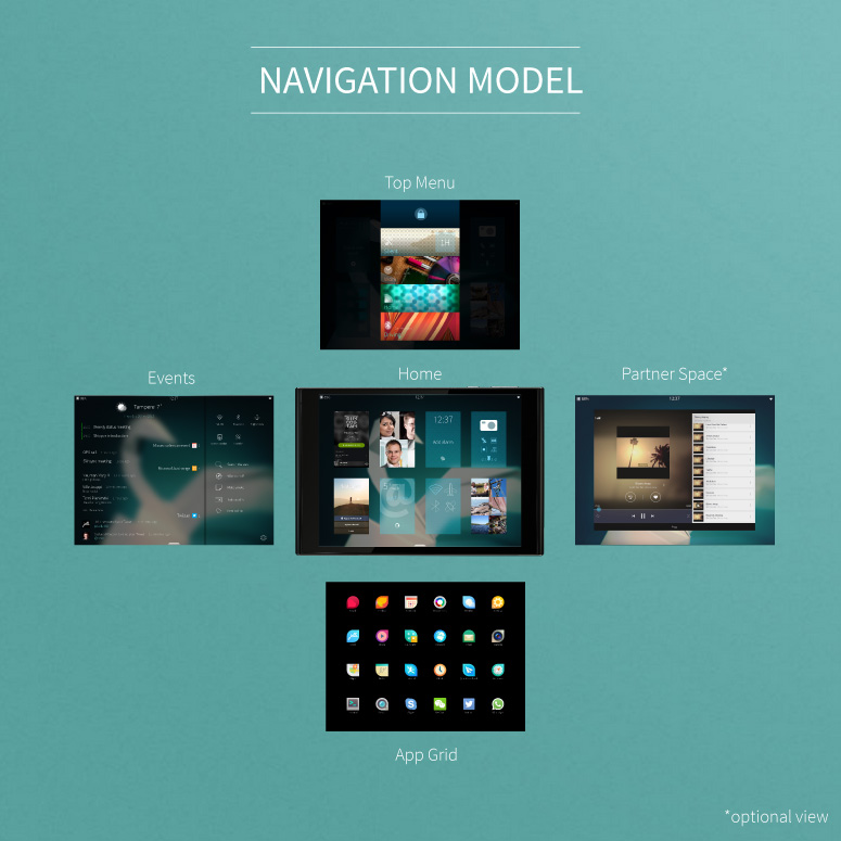 Simple mental model of core views
We rearranged the core views so that they form a simple, easy to memorize model. Your relevant content is right in the center, whether it’s your notifications, personalized quick actions, running apps or optional content from a partner. Functions affecting the overall device behavior are accessible from the top. From the bottom you can always access your pool of apps with a simple edge swipe .
Edge swipes are consistent and context independent
Each edge swipe has one function. Left and right edge swipe moves you back to ‘Home’, a bottom edge swipe brings up the ‘App Grid’ and a top edge swipe opens the ‘Top Menu’. Simple as that.
Evolving with you
You can tailor the experience according to your personal needs and wishes. The baseline is simple and easy already when you get hold of the UI for the first time. However when you advance you are able to unlock handy tricks, e.g. closing an app via a top edge swipe or direct access to Events from anywhere in the UI.
Subtle hints and clear feedback
Subtle hints combined with improved visual feedback teach you how to use the device while exploring it. The different nature of UI views, like the Top menu and App Grid, are introduced to you via different visual graphics and motion graphics. This all makes the UI more predictable.
‘Built-in forgiveness’
When using devices quickly or in a hectic environment you sometimes may e.g. miss defined technical threshold for edge swipes. To avoid slowing you down we predict your intent and provide the intended function or view.
Balanced layouts and meaningful motion graphics
We put a lot of attention into layouts, scaling factors for fonts and graphical elements so that they are rendered beautifully and balanced on lower as well as higher resolution displays. The applied animations are meaningful and always serve a purpose instead of just being eye candy.
Separated Lock Screen from Home
The combined Lock screen and Home with a status area in between seemed to be a neat idea. However, it made Home complex and difficult to maintain from the technical point of view. Furthermore it restricted us to offer you a competitive UX in case of an enabled device lock code. Therefore we separated the two views from each other.
The separation of the two views also required a re-design of the status area. Here we maintained the great solution enabling apps to use 100% of the screen estate as well as the possibility to peek from an app to see status info. However we eliminated the two different interactions on Lock and Home to access the full status area, as well as the vertical jump effect of Home after swiping an app away. This greatly calmed down the behavior and makes it easier to follow the app and its position in the Home view.
On the Lock screen you can now apply either a left or a right edge swipe to unlock the device and access Home; the same logic as you apply when navigating from an App to Home.
The location of notification icon(s) on the Lock screen are now linked to the related action. This means whenever there is a notification icon, then we offer you a handy shortcut directly to Events via a left edge swipe.
Laid back app covers on Home
Home can now feature as many app covers as you want, and there is no limit to 9 visible ones anymore. In addition, the App covers do not all shuffle around anymore after swiping one app away. This is achieved via a new logic for positioning the covers: newly opened apps will go the end of the grid, while already open apps will go back to the same location where they have been. This change makes the whole experience more laid back, it’s easier to memorize the location of a certain app cover, and thus makes multitasking even more powerful.
Reduced set of Cover actions
Cover actions are handy. They become even handier if you select actions frequently used, if they really shorten a task flow and also make the cover easier to identify. After critically reviewing our current set we had to admit that some actions did not fulfill our targets anymore. Therefore we removed some, without removing the support for two cover actions altogether because they are convenient for e.g. the music playing use case.
In order to avoid accidentally activated actions while swiping between Home, Events and the new ‘Partner space’ we altered the interaction of the cover action, from horizontal swipe towards a tap interaction. We liked the gesture support, but when reflecting this against to the project objective then we had to let it go.
The same OS means the same UI
What is important to remember is that when the Jolla Tablet is ready, we will have one Sailfish OS, which supports different HW architecture, different screen aspect ratios and resolutions. This means that we will run the same SW and the same user interface on both the Jolla tablet and the Jolla smartphone; except a few modifications due to the smaller screen size of course.
To be continued…
There are probably many more insights, topics or questions to the OS design, and we will come back to those in future blog posts. Nevertheless we hope that at least some of your questions could be answered or clarified in this post already.
Please continue providing us feedback and/or suggestions via together.jolla.com or our other channels; user feedback is the key element in developing the design further and improving the OS over time.